Mako Matsuzaki
JapanMy Contributions
Logo Design and UI Design for their websiteProject Duration
48 HoursLogo and Web UI Design for Mako Matsuzaki
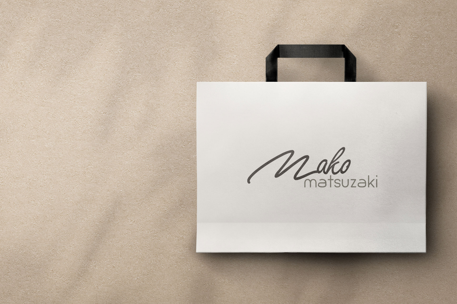
Mako Matsuzaki is a Japanese friend working for abaya design. Clients would like to get a typographic logo design and minimal web ui design from me. The main challenges was for the design is to create a minimal design by using script types faces and they expected monochromatic color. So, I need to keep more focus on the typefaces and the color. I researched about the brand and created 3 concepts for them and they accepted the first one and they were very happy with the output. For the website it was a ecommerce website and I can deliver them a clean ui based on the logo and they accepted the delivery without any modification.Light for Life
Australia based Bangladeshi children focused organizationMy Contributions
Logo and Brand Identity Designs including Brand GuidelineProject Durations
32 HoursLogo & Brand Designs of Light for Life
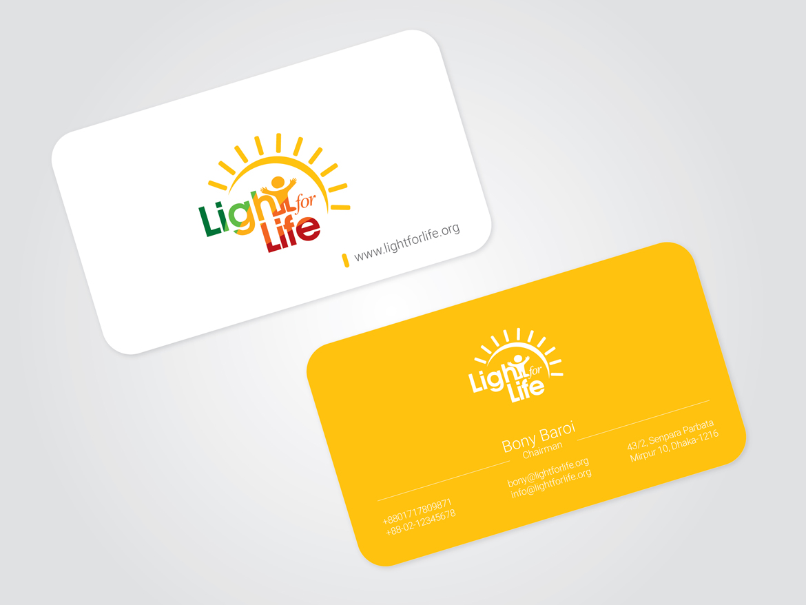
Light for Life is a Australian based Bangladeshi Child focused organization. They are expecting a logo for their organization where they would like to focus on their children's. Since this is a child focused organization and and the name is light for life so, I tried to make a concept where I can incorporate a sign about the sunshine and obviously some childes can be there. For the color I thought colorful and warm colors will be the best choice for this logo. Then I made three concepts for them and they accepted my first concept without any modification. After getting approval for the logo I made the brand identity designs and as well as a brand guideline for the company. The client was very much happy with the output.Creative IT Institute
Dhanmondi, DhakaMy Contributions
Logo Design and Brand Identity including Brand GuidelineProject Duration
60 HoursLogo, Brand Identity and Brand Guideline Design for Creative IT Institute
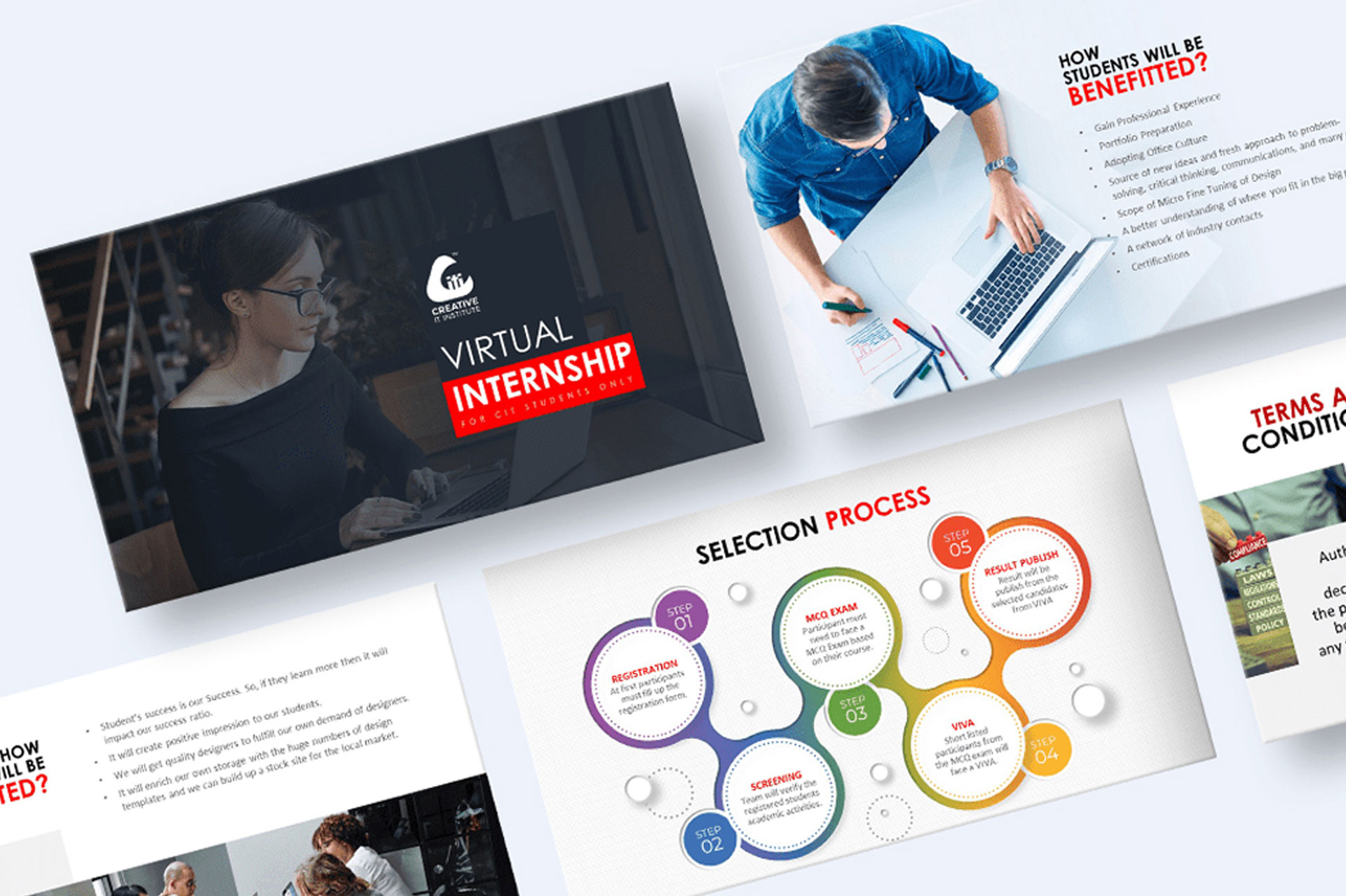
Creative IT Institute is a private training institute in Bangladesh that offers courses on various IT topics such as web design, graphics design, digital marketing, programming, and more. The institute was established in 2008 and has since become one of the leading IT training centers in the country. The institute owner explains- creative it institute is focused on their students success and for that they are giving intensive care to the students and they minimizing the gap between students to students and students to mentor. That is why the relationship between students and mentor is very friendly in their institute and students can easily ask anything during the study. The mentors stays beside the students as a friend, as a guardian and as a mentor. They loved their all students. So, I need to cover all the things in to the logo and I tried to show the relationship first and if you see the center of the logo there you will find three letter "iti" which means IT Institute and symbolize by the two students and a mentor where mentor keeping his on to the students shoulder. The Red shape "C" covered the students and mentor (iti) which means the red shape "C" taking care of their students and mentor (iti). As a whole it means "CITI" which is Creative IT Institute. The red color reflects the Love. While I explains the thoughts with the owner of the Institute; He loved it so much and approved the concept.my creations
Related Portfolio
I create solutions that are bold and forward-looking


